We created the report that will be the basis for the dashboard component. Today we will finish by actually adding it to the dashboard!
Step 1: Add a chart to your source report
In order to create a complex dashboard table, you must first add a chart to the source report. The chart on the report itself does not have to look meaningful: in fact, it usually doesn't!
Go to your report, click "Customize" and then click "Add Chart":
Choose a scatter chart as the type of chart, and on the chart data tab, set all four chart data fields to the meaningful groupings of your report, as shown:
Choose a scatter chart as the type of chart, and on the chart data tab, set all four chart data fields to the meaningful groupings of your report, as shown:
Click "OK" and then Save and Run your report. You will notice that the resulting scatter chart is not very interesting as a chart, but it allows us to create a more complex dashboard table.
**If you want to make the chart less prominent on the report itself go to the "Formatting" tab on the chart editor and choose to make the chart size "Tiny" and the chart location "Below Report"!**
**If you want to make the chart less prominent on the report itself go to the "Formatting" tab on the chart editor and choose to make the chart size "Tiny" and the chart location "Below Report"!**
Step 2: Go to your dashboard
You probably have multiple dashboards in your salesforce org; choose the one where you would like to add this component, or start a new one. For more about creating and editing dashboards, check out: Cloudy's Chalkboard: Creating Dashboards
When you are on the correct dashboard, click "edit"
Step 3: Drag a table component onto the dashboard
Step 4: Drag the correct report onto the component.
Note that you must switch from the "Components" tab to the "Data Sources" tab in the Dashboard Builder palette on the left side.
(For instructions about how to build this report, see last week's post:
Cloudy's Chalkboard: Tracking the stars in your salesforce universe - Part 1)
Step 5: Edit the table
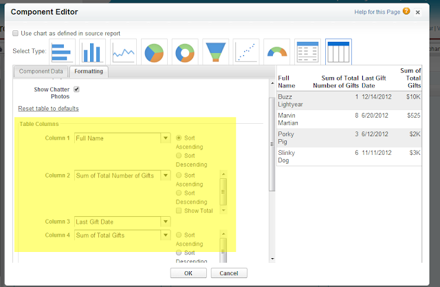
The default settings of the table that appears will only show 2 columns. Click the wrench in the upper right corner of the table to see more options.
On the Component Editor that appears, choose the Formatting tab and click "Customize table". You will now be able to edit the table columns to show all four data points:
 Congratulations! You have created a complex dashboard table that will allow you to keep track of important donor relationships that might be at risk. Consider scheduling this dashboard to refresh regularly, and/or have it emailed to interested parties automatically.


No comments:
Post a Comment